
Fifa World Cup 2026 Reveal : Ugly or Modern?
.png)
Fifa unveiled the logo for World Cup 2026.
At first glance, it looks like a joke. The World Cup image is superimposed on the number 26 with Fifa name in black. There are no traces of where it is going to be held. For the record, it will be in 3 countries - USA, Mexico and Canada.
To be honest, it looked like it was done by a six-year-old using Canva.

Compared to previous years, the stark difference is that the previous rendition uses original artwork instead of an image.
.png)
It also included the host country on the logo. In 2002, Japan and Korea held the world cup jointly, and the names were on the logo too.
It seems like someone just ask AI to design this for this. The designer probably used the description - Use the World Cup image as center of the logo, have 26 at the background and add the world FIFA. Make it black to look sleek.
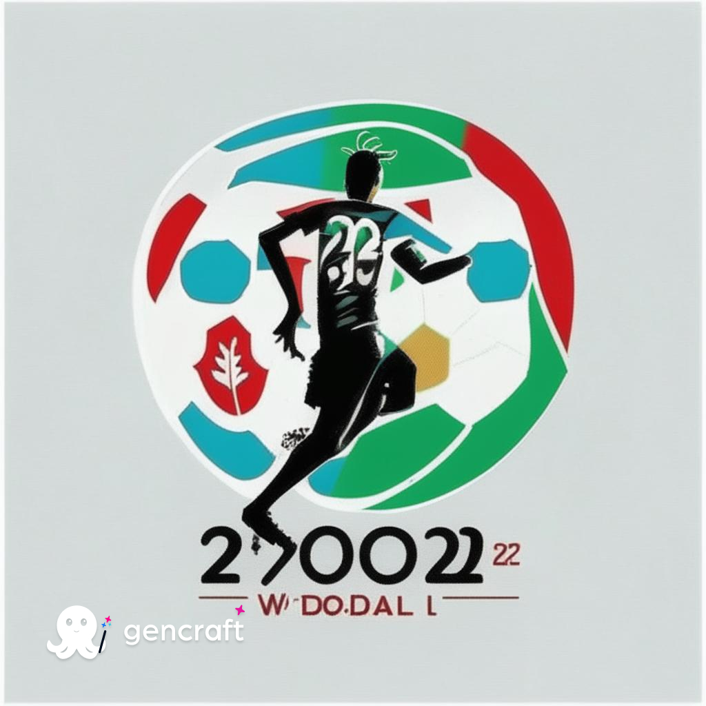
We also tried to ask AI to generate a Logo, it's not perfect, but we like how it incorporates the flag colours of Mexico, Canada and USA on the ball. If FIFA wants this design, they know where to find us.


No comments